The Map is back.
K-12 Cyber Incident Map v2 | © EdTech Strategies, LLC. All rights reserved.
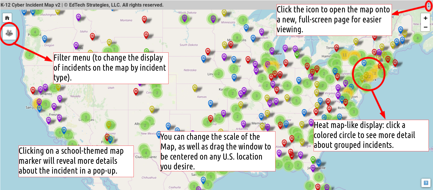
The newly refreshed interface of the K-12 Cyber Incident Map offers members of the public, policymaking community, and educators much of the data they have come to expect, while offering significant improvements to the user interface and back-end administration workflow required to maintain it. Allow me to highlight some of the changes and new features of the user interface:
- The updated map interface is built on technology maintained and provided by OpenStreetMap contributors, self-hosted on the k12cybersecure domain. This represents a significant step forward in user privacy and control, as the original K-12 Cyber Incident Map was built and hosted on free-of-cost technology offered by Google, which was dynamically published on this site.
- The new interface addresses the challenge of the growing number of incident markers obscuring the Map. While a map over-crowded with markers sends a certain sort of message, it also ends up confounding the real story about the prevalence and location of incidents with the scale of the map. The new interface has heat map-like features that group together incidents located close to each in a colored circle. These circles display a number – indicating the number of incidents in the group – and the color of the circle is also an indicator of the number of incidents (e.g., green circles represent a small group of incidents, yellow circles represent larger groups, etc.). Clicking on a colored circle will change the scale of the Map to display nearby incidents.
- While the color coding of incident types remains a feature of the K-12 Cyber Incident Map, there is now a pop-up menu that allows users to filter the Map to only display incidents of a certain type. If you are only interested in seeing school district data breach incidents, you can set the Map to only display those incidents!
- Finally, depending on the screen you are viewing the Map on, it may seem small. By clicking the icon in the upper right hand corner of the Map, you can open a new web page that will display the Map in a full screen interface. All the same features and data, just on a bigger page.
Like with the last version of the Map, you can click on a map marker to display more details about the incident, as well as zoom and click and drag the Map to focus it on the part of the U.S. that you are most interested in.
In the coming weeks, expect an update of the FAQ for the Map to reflect the responses to other commonly asked questions and changes in the how the new Map interface works.
Thanks for your continued interest and feel free to offer any feedback via @K12CyberMap or our contact form.